
As an industrial HMI (Human - Machine Interface) supplier, I've witnessed firsthand the crucial role that icons play in the usability and effectiveness of industrial HMIs. Icons are the visual language that bridges the gap between human operators and complex industrial machinery. In this blog, I'll share some essential design guidelines for industrial HMI icons.
1. Simplicity and Clarity
The first and most fundamental principle in designing industrial HMI icons is simplicity. Industrial environments are often high - stress and fast - paced, where operators need to make quick decisions. Complex icons with too many details can be confusing and time - consuming to interpret.
For example, if you're designing an icon to represent a valve, a simple, stylized shape that clearly shows the valve's basic structure is far better than a highly detailed, realistic illustration. A basic valve icon could be a simple rectangle with a circular handle. This straightforward design allows operators to recognize the icon at a glance, even from a distance or in low - light conditions.
Icons should also be unique and distinct from one another. In an industrial HMI, there may be multiple icons on the screen, and it's essential that each one can be easily distinguished. Avoid using similar shapes or colors for different functions. For instance, don't use a blue triangle for a "start" function and a slightly different blue triangle for a "pause" function. This can lead to operator errors and potentially dangerous situations.
2. Consistency
Consistency is key in icon design for industrial HMIs. This includes consistency in style, color, and meaning.
Style Consistency: All icons in an industrial HMI should follow the same design style. Whether it's a flat, minimalist style or a more traditional, detailed style, maintaining a unified look makes the HMI more aesthetically pleasing and easier to use. For example, if one icon is designed in a flat, geometric style, all other icons on the same HMI should also adhere to this style.
Color Consistency: Colors are a powerful tool in icon design, but they need to be used consistently. In industrial HMIs, certain colors are often associated with specific meanings. For example, green is commonly used to represent "go" or "normal operation," red for "stop" or "alarm," and yellow for "warning." By using these colors consistently across all icons, operators can quickly understand the status of the machinery.
Meaning Consistency: The meaning of an icon should be consistent throughout the HMI. If an icon represents a "motor start" function on one screen, it should have the same meaning on all other screens within the same HMI system. This helps operators build a mental model of the system and reduces the learning curve.
3. Scalability
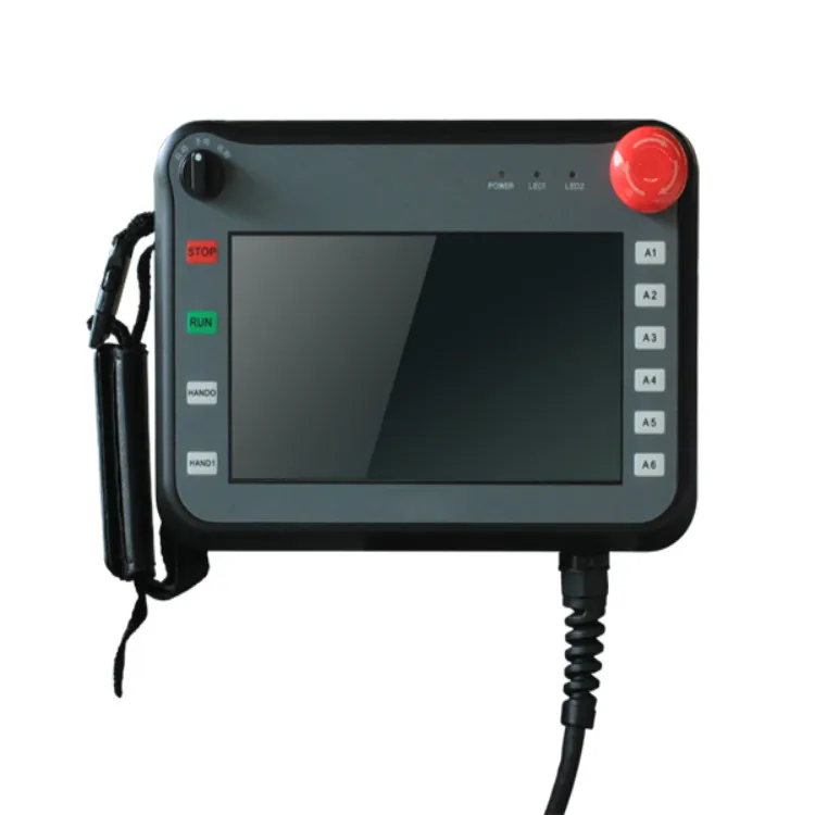
Industrial HMIs come in various sizes, from small Handheld HMI devices to large control panels. Icons need to be scalable without losing their clarity and legibility.
When designing icons, use vector - based graphics. Vector graphics are resolution - independent, which means they can be resized to any size without losing quality. This is especially important for industrial applications, where icons may need to be displayed on different screen sizes and resolutions.
For example, an icon that looks great on a large outdoor touch screen may be too small to read on a handheld device. With scalable icons, you can ensure that the icon remains clear and recognizable regardless of the display size.
4. Context Awareness
Icons should be designed with the context of the industrial process in mind. Different industries have different requirements and terminologies, and icons need to reflect these specificities.
In the automotive industry, for example, icons related to the Car Touch Screen may need to represent functions such as engine temperature, fuel level, and seatbelt status. These icons should be designed in a way that is familiar to car drivers.
In an outdoor industrial setting, where the HMI is used on an Outdoor Touch Screen, icons need to be visible in bright sunlight and other challenging environmental conditions. High - contrast colors and bold shapes are often used to ensure visibility.
5. Accessibility
Accessibility is an important consideration in industrial HMI icon design. Not all operators may have perfect vision or motor skills, so icons need to be designed to be accessible to a wide range of users.
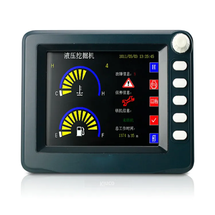
Visual Accessibility: Icons should have sufficient contrast between the icon and the background. This is especially important for operators with visual impairments. Additionally, avoid using colors that are difficult to distinguish for people with color - blindness, such as red - green combinations.
Motor Accessibility: For touch - screen HMIs, icons should be large enough to be easily tapped by operators, even with gloves on. The spacing between icons should also be adequate to prevent accidental taps.
6. Testing and Feedback
Once the icons are designed, it's essential to test them with real operators. User testing can reveal any issues with icon recognition, usability, or clarity that may not be apparent during the design phase.
Conduct usability tests in a simulated industrial environment. Observe how operators interact with the icons, how quickly they can recognize them, and whether they understand their meanings. Collect feedback from operators and use this information to make improvements to the icon design.
7. Compliance with Standards
Industrial HMIs are often subject to various industry standards and regulations. Icon design should comply with these standards to ensure the safety and reliability of the system.
For example, some standards may specify the size, color, and shape of certain icons. By following these standards, you can ensure that your industrial HMI is legally compliant and meets the expectations of your customers.
Conclusion
Designing effective industrial HMI icons is a complex but essential task. By following these design guidelines - simplicity and clarity, consistency, scalability, context awareness, accessibility, testing and feedback, and compliance with standards - you can create icons that enhance the usability and safety of industrial HMIs.
If you're in the market for high - quality industrial HMIs with well - designed icons, we're here to help. Our team of experts has extensive experience in designing and manufacturing industrial HMIs that meet the highest standards. Contact us for more information and to start a procurement discussion. We look forward to working with you to find the perfect HMI solution for your industrial needs.
References
- Norman, D. A. (1988). The Design of Everyday Things. Doubleday.
- Nielsen, J. (1993). Usability Engineering. Morgan Kaufmann.
- ISO 9241 - 11:1998. Ergonomic requirements for office work with visual display terminals (VDTs) - Part 11: Guidance on usability.